
Making of DM_Zest
BACKGROUND
DM_Zest is a HL2DM map I made for a contest at MapCore called "The Cube Challenge". The rules were simple: The playable area of the map should be no larger than a 1024x1024x1024 cube. For reference, a player model is 72 units high in HL2DM.
My idea was to make a stylish and clean map reusing some textures and ideas from my Zest Foundation UDK Scene.
This map took me a total of 24 hours of work to complete. You can download it here.
TEXTURES & MATERIALS
I already had a pretty simple deathmatch layout in mind when I started, so I decided to work on textures first. I knew the gameplay of the map wouldn't be stellar, so it would be better to focus on the art early on.
To begin with I collected a few textures from the UDK Scene and converted them to the Source engine format. Most of them were 1024x1024, so I scaled the diffuse maps down to 512x512 and normal maps to 256x256, which are more acceptable sizes in Source Engine games.
I usually start with the normal map when working on clean textures. This makes easier to focus on the most important shapes early on. Most of the times I use a combination of hand-painted normal maps and hi-poly bakes. Rule of thumb is: If it can be done quicker on Photoshop don't model it.
100% "HANDPAINTED" NORMAL MAP WORKFLOW
Philip Klevestav has already written several tutorials on this subject, so I'll try to avoid reinventing the wheel here. I'll just try to show my usual workflow, which isn't much different from his.
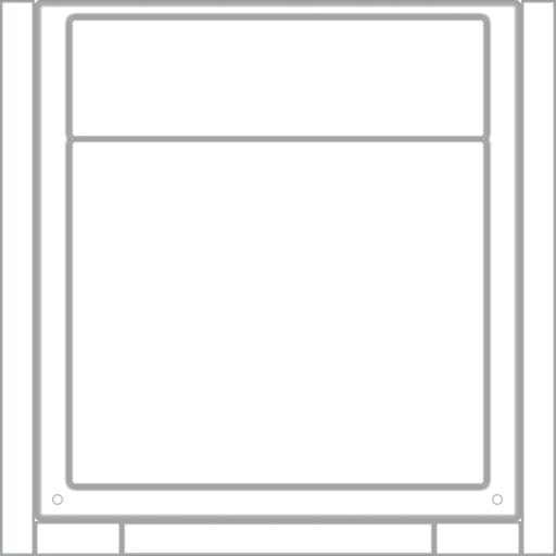
To begin with, I draw a few rounded rectangles to define the basic shape of the texture. Make sure to work with vectors if you want to keep the edges as round as possible.
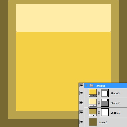
It's a good idea to keep these shapes set apart in a layer group because you will need them later on when masking the diffuse maps.
I then select each vector shape (ctrl + click on layer) and convert to Normal Map shape using a handy Photoshop script called nDO:
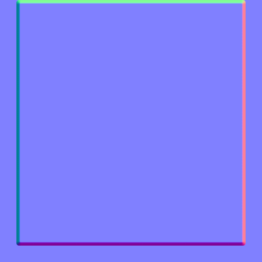
Note: The green channel had to be inverted afterwards
For the diffuse map I start with an "ambient occlusion" map using the old trick of contrasting the normal map's blue channel, but with a little twist:
- Copy paste the normal map's blue channel to a new layer
- Contrast it a bit
- Duplicate and apply a "Maximum" filter to make the lines thinner. This layer will represent the deeper areas of the surface.
- Duplicate this layer and apply a gaussian blur filter. Set this layer to multiply. You might need to have two copies of this blurred layer on top of each other to make the effect more visible. This layer will represent a more diffuse shadow and generally give the texture a bit more volume.
- Move the original contrasted layer up on the layer stack and set it to Multiply
With this method you basically have 3 layers of "fake ambient occlusion" information:
- General AO (original layer)
- Diffuse shadow information (blurred layer)
- Deeper areas (the layer with the "Maximum" filter applied)
Play with the opacities of each layer until you are satisfied with the result. You can also hand paint some shadows by hand if needed, because the blue channel alone rarely accuretely reflect the texture's volume.
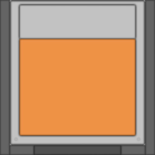
After that I use the original masks I created earlier to mask the texture's colors. This is the fun part where you can actually feel how your texture will look in the end. Get the colors right here and your texture will look good in the end!
Now it's time to add some surface detail. I start overlaying and multipling a few base textures found on cgtextures:
I then hand-paint some grime in using a custom brush I made:
Now I hand-paint some chipped off edges using the same brush. A good tip here is to use a flat color instead of setting the layer to screen or linear dodge. This will usually yield better results on metal textures:
Don't overdo this otherwise your texture will look really amateur'ish!!!
OK, now for the final adjustments. First I generate a cavity map using xNormal's Photoshop plugin and overlay that on top of my texture.
I then make a copy of the fake AO layer, invert the colors, blur it a bit and set the layer to Screen on 60% opacity. This is a great way to add some more subtle volume detail and to soften the AO map a bit:
Optional: You can make a copy of the layer stack on a new layer (Shift + CTRL + E on a blank layer) and apply a subtle sharpen filter if you wish.
The specular map is pretty straight-forward. Duplicate your diffuse group, desaturate it and contrast/level each dirt and edge definition layers as you wish. You can also overlay/multiply additional textures to have more variation. It's generally a good idea to have extra detail on the specular, otherwise you might end up with a boring and flat map.
Another thing I like to do when working with panels like this is to vary the specular intensity a lot. In this texture I chose to have more specularity on the darker parts and vice versa. This creates interesting specular variations ingame.
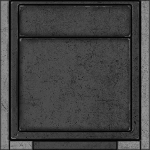
My final specular map looks like this:
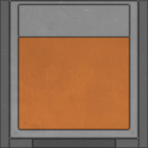
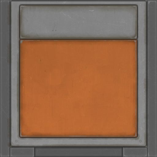
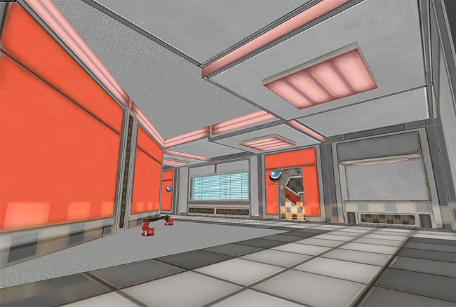
The final result:
LAYOUT
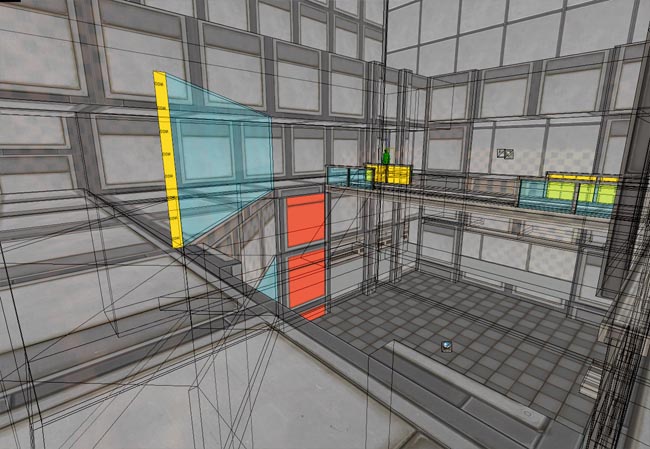
Note: Excuse me for the horrible checkered pattern on the following screens. This is a Valve Hammer Editor bug and I have no idea on how to fix it.
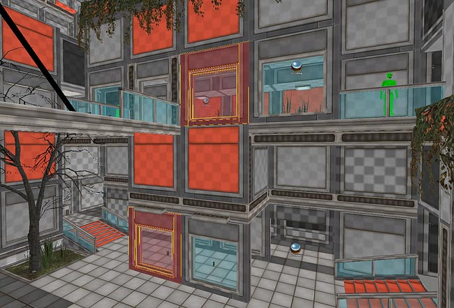
The first step was to make a blockout map using my custom textures to get the right feel early on. When working on blockouts try to be as loose as possible, using ramps instead of stairs and other simplifications like that. A blockout is essential to get the proportions right and to check if the map's flow is good. Refrain from adding any details or working on lighting at this point. The first blockout of the map looked like this:
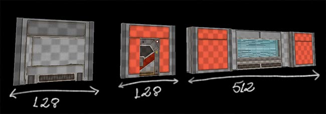
During this phase try to predict where I can use modularity. What this means is to always try to have round values on lenghts and heights. A corridor that is 512 long, 128 wide and 192 high is much easier to break up in segments than one that have wild values.
GEOMETRY
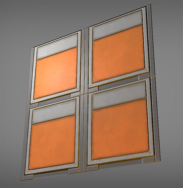
Now comes the fun part. Detailing this map was actually quite easy, because I saved a lot of time instancing small segments of modular brushwork:
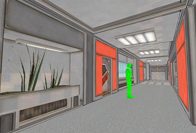
More examples of modularity used throughout the level:
One thing to keep in mind (and that most aspiring level designers neglect) is sillouette/form. If you want to make a strong first impression your map needs to have a few basic aspects right. One of them is sillhouette. Sillhouette/form helps the eye glide through the composition, making the map generally easier to navigate.
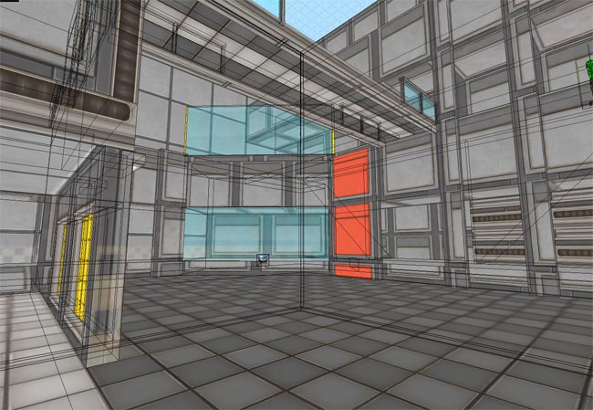
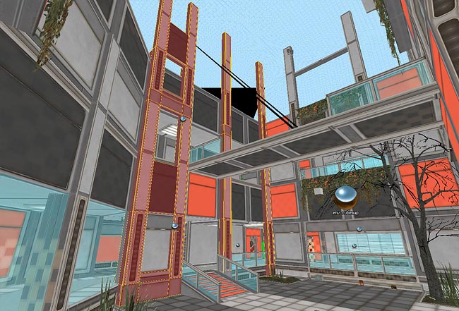
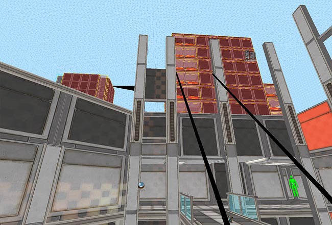
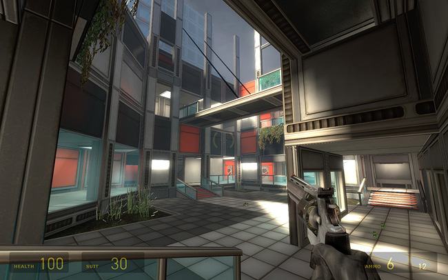
It also helps letting some of your intentions clearer to the player. Layout wise this map is pretty simple, since it has only two height levels. The vertical action plays an important role here and I wanted to make this evident. To do so I added vertical structures that stretch out of the playable area all around the main arena. My intentions with this was to make the player unintentionally have an urge to look up when he's walking through the first floor and to make the map appear larger than it really is:
The composition reads sort of like this with the vertical strucutres:
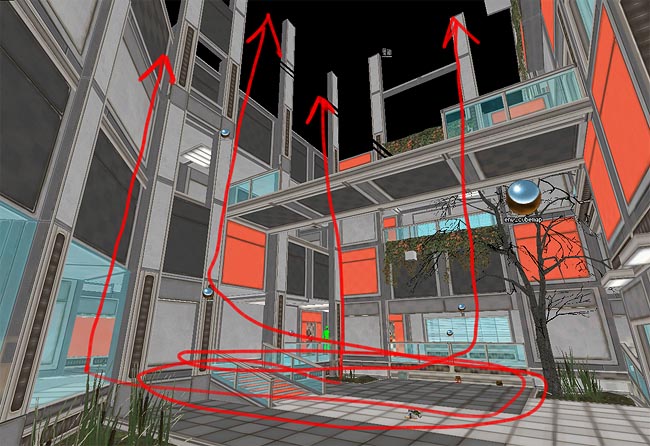
Without the vertical structures the two floors don't connect to each other and the eyes might stay focused on the level they are on only. Not interesting at all in such a small map:
Those vertical structures wouldn't make much sense in real life but that's the fun of being a 3D artist: You can use your imagination and have abstract geometry in your works that people generally won't even bother with it. Of course all of this is subjective and open to discussion but If you want to study more about this subject I recommend reading about the Gestalt Principles of Visual Perception. Here's a nice starting point. You won't regret it!
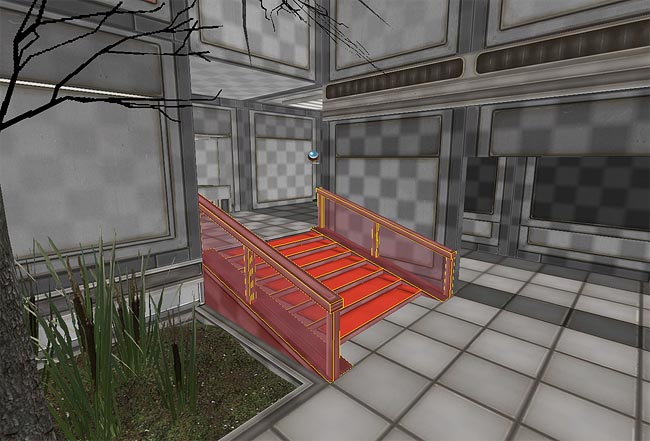
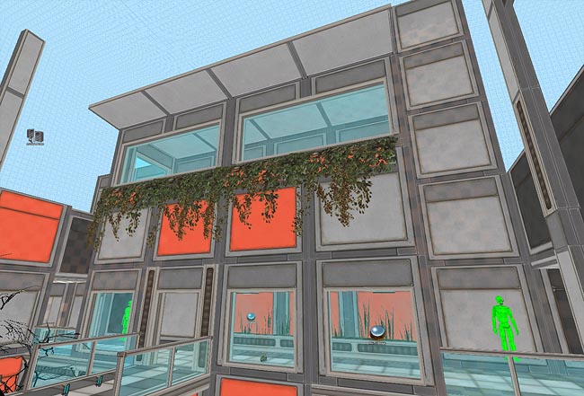
Since the playable area of this map is so small it was important to make it appear larger than it really is. Besides the vertical structures I talked above, I added some innacessible areas too. Here's a large window that could house an office or even a lounge:
Next, I added some buildings outside the map. I'll be honest, these buildings look horrible and I'm not proud of them at all. They were the last thing I added to the map when the deadline was 5 minutes away :P They do their job though.
LIGHTING & FINAL TOUCHES
For the lighting I decided to go with texture lighting only. They are more convenient and look much better than point/spot lights on the Source Engine in my opinion. Simon Barsky wrote a great tutorial on this subject.
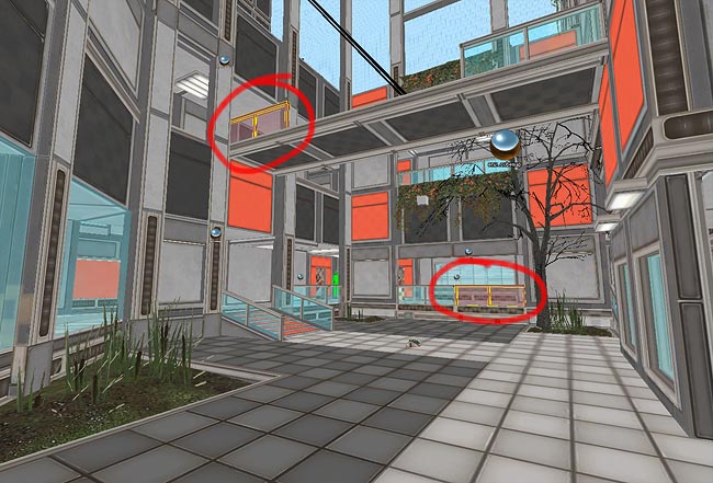
The great thing with texture lighting is that it's very easy to work with them on the Source Engine. For this map I used only one light emitting texture (the lights.rad values are: 255 242 215 1200).
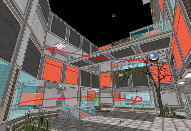
I highlighted the light emitting surfaces in red:
The results ingame:
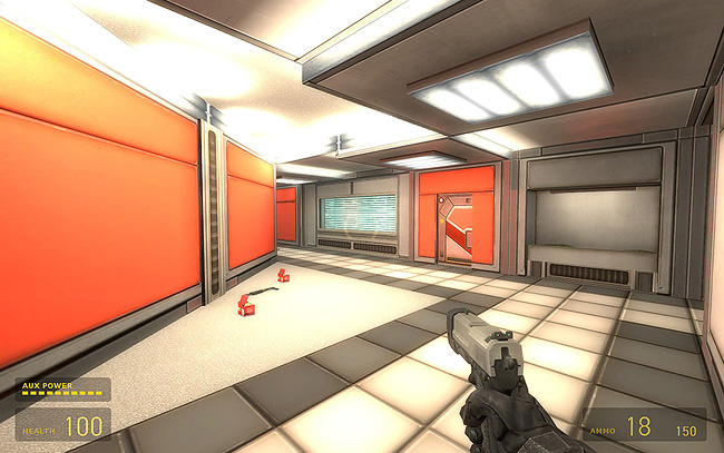
Light emitting surfaces and Source's Radiosity Lightmap Generator go super well in my opinion. I really can't understand why it's common thinking in the Source community that texture lights are a thing of the past.
This technique has its disadvantages though. For some reason the lightmap generator gives different results on different compiles. Notice how the lights on the left fixture aren't continuous, even though they are on the right fixture.
Last but not least I always like to have a subtle fog iny my environments. It doesn't make much sense in most cases but it helps separating the foreground from the background. Notice how lighter the background is compared to the foreground. Again, another visual perception principle applied to Environment Art:
FINAL THOUGHTS
Working on this map was a lot of fun and a big challenge since I started it so close to the deadline (2 days before it). BSP is unfortunately a thing of the past now in the industry but I love the freedom it provides. I don't think I'd be able to make this map AND the art AND everything else in under 2 days if I had modeled this in 3DS Max.
I hope you enjoyed reading this and learned a thing or two!