
I’ve been playing RE3 Remake and I’m in love with the lighting. The team used every trick in the book to achieve a believable and immersive world, while still being very gamey and helping with navigation.
In this post, I don’t intend to write a comprehensive technical guide on how the rendering engine works, but instead, show several examples of lighting techniques and what they are accomplishing.
Great lighting becomes part of the background, creates shapes, helps materials read properly, and subtly guides the player around the level.
Lighting Model
I haven’t done a proper research on this topic so I’m just talking from observation here. Please let me know if you have more information and this is not accurate.
The game uses fully dynamic lighting with reflection probes + screen space effects. Very similar to what you can achieve in Unreal by going this path, or in Unity with the HDRP and fully dynamic lights.
The interesting thing about RE3 Remake is that dynamic lighting in general looks much flatter than baked lighting, especially in day scenes with lots of light bouncing, but they were able to cleverly work around these limitations and deliver a game that looks much sharper than baked lighting ever could.
Usages of Lighting
In RE3 Remake, lights generally perform one (or more) of these functions:
- Guiding the player
- Creating shapes
- Enhancing shapes and silhouettes
- Material definition
- Atmosphere
One thing to keep in mind is that they do a great job at having varied light sources. One aspect of their great lighting is not just the actual placement of light entities, but of using believable and interesting sources (such as different lamps, fire, neon signs etc…).
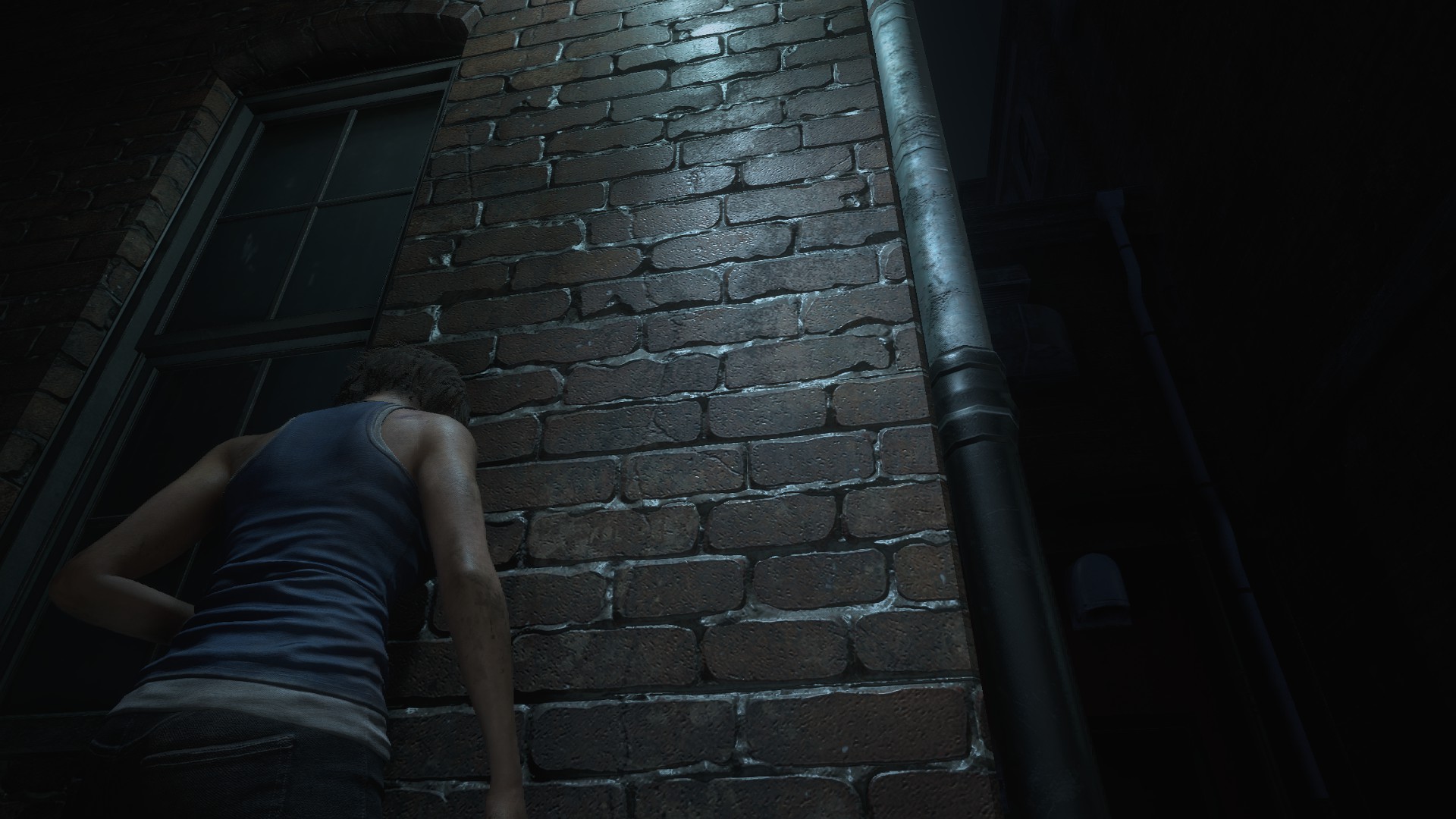
Pictures speak much louder than words. So I will just examine different screenshots and explain what’s happening:
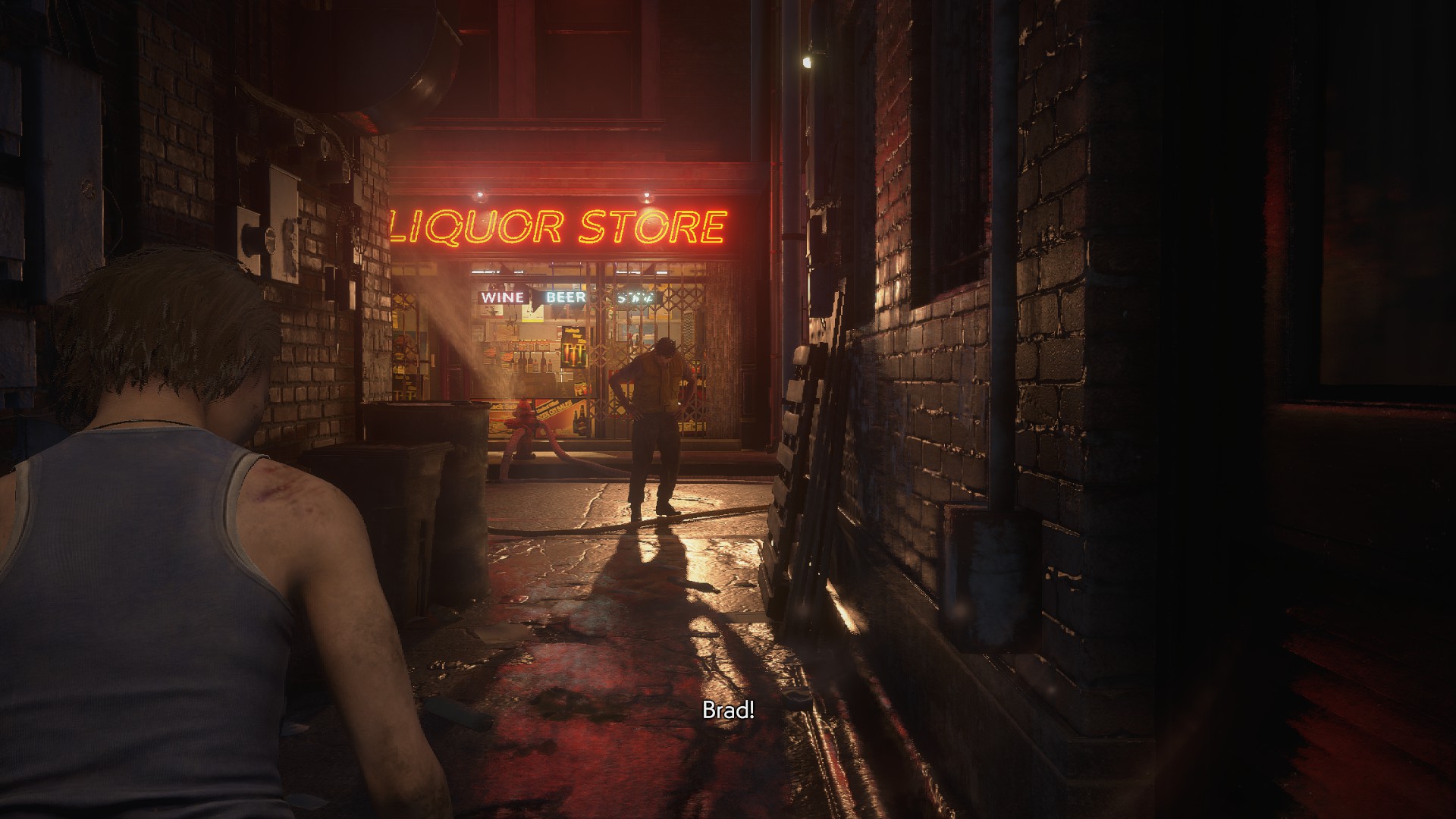
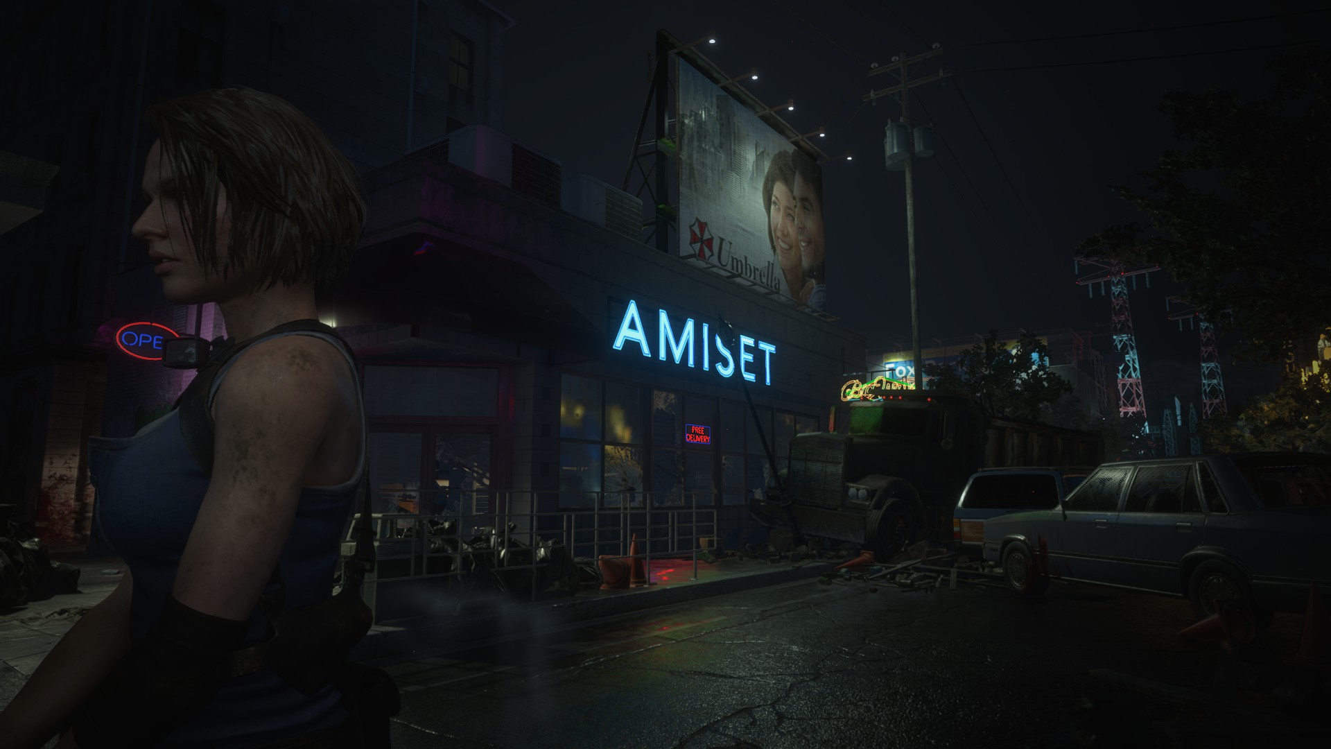
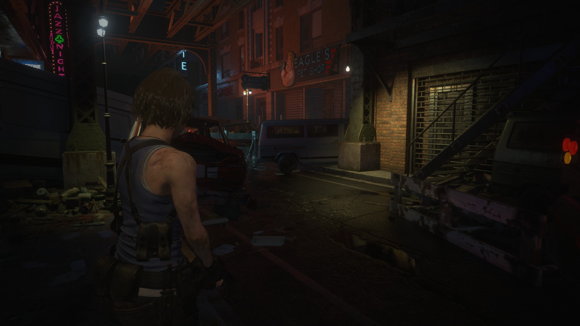
Big frustum/spotlight here with lines converging towards the objective. The light is placed at the right height to create a specular response on the brick wall to the right, making an otherwise dull-looking surface interesting. The Neon is bright enough to create a nice bloom, but also not so bright as to explode the screen. (Be careful to not make your neon signs too bright when working in similar scenes!)
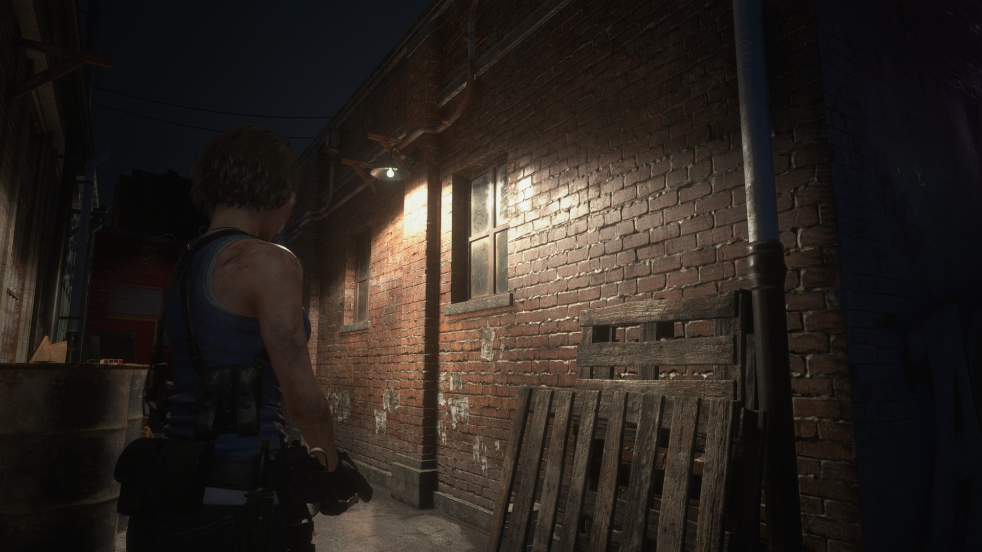
This is a common sight throughout the game. Lights carefully placed to create a specular response on a surface and help sell the material. They also put a lot of work into the roughness maps, making these surfaces very interesting to look at! Also notice how the specular response is controlled and subtle.
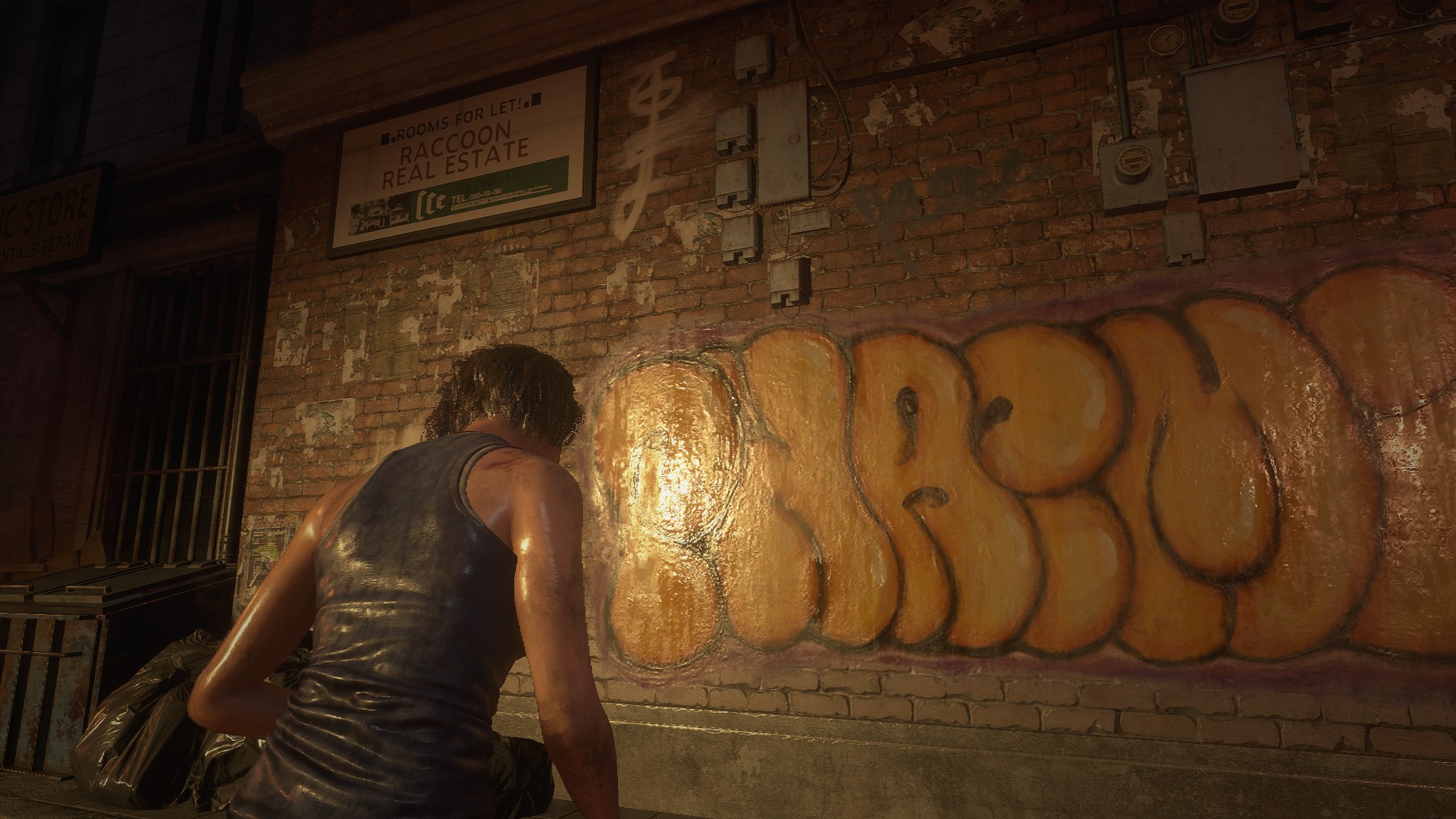
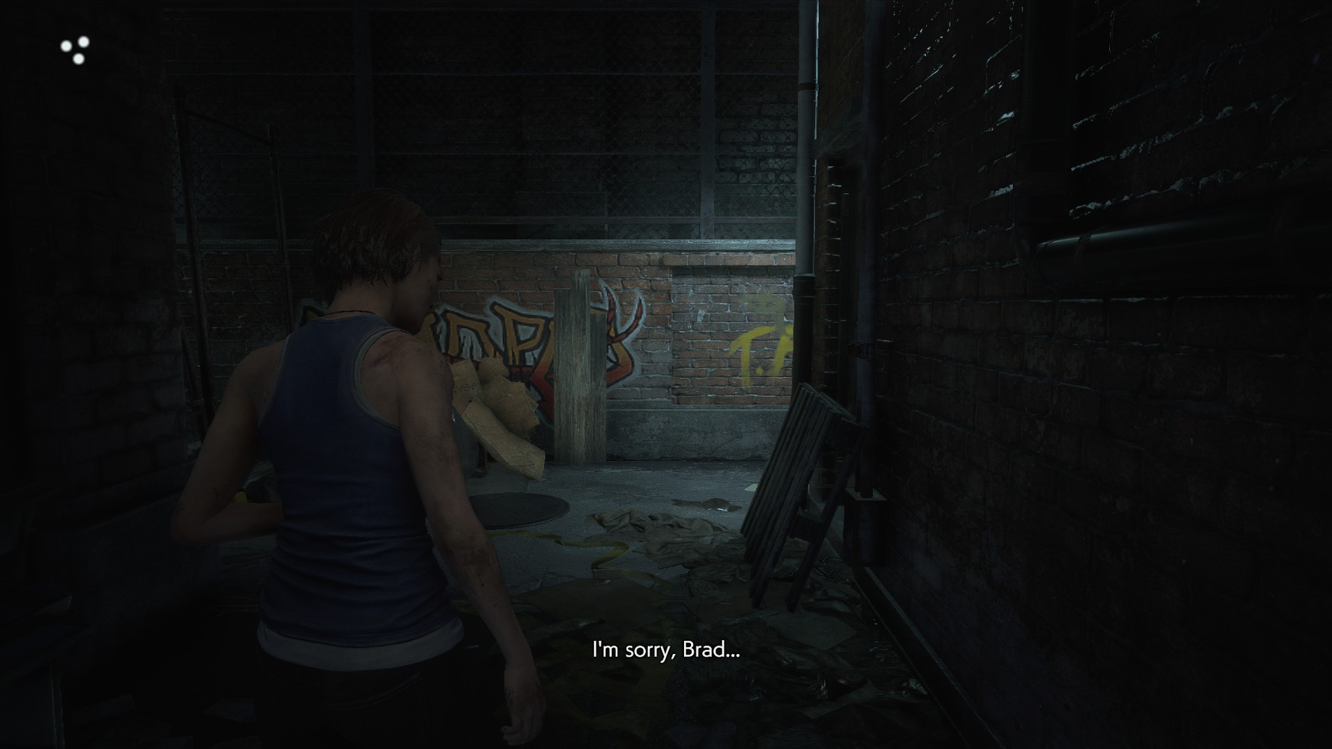
Another light at the correct height to create a nice specular response on the graffiti. Without this light here, it would be impossible to tell the materials apart.
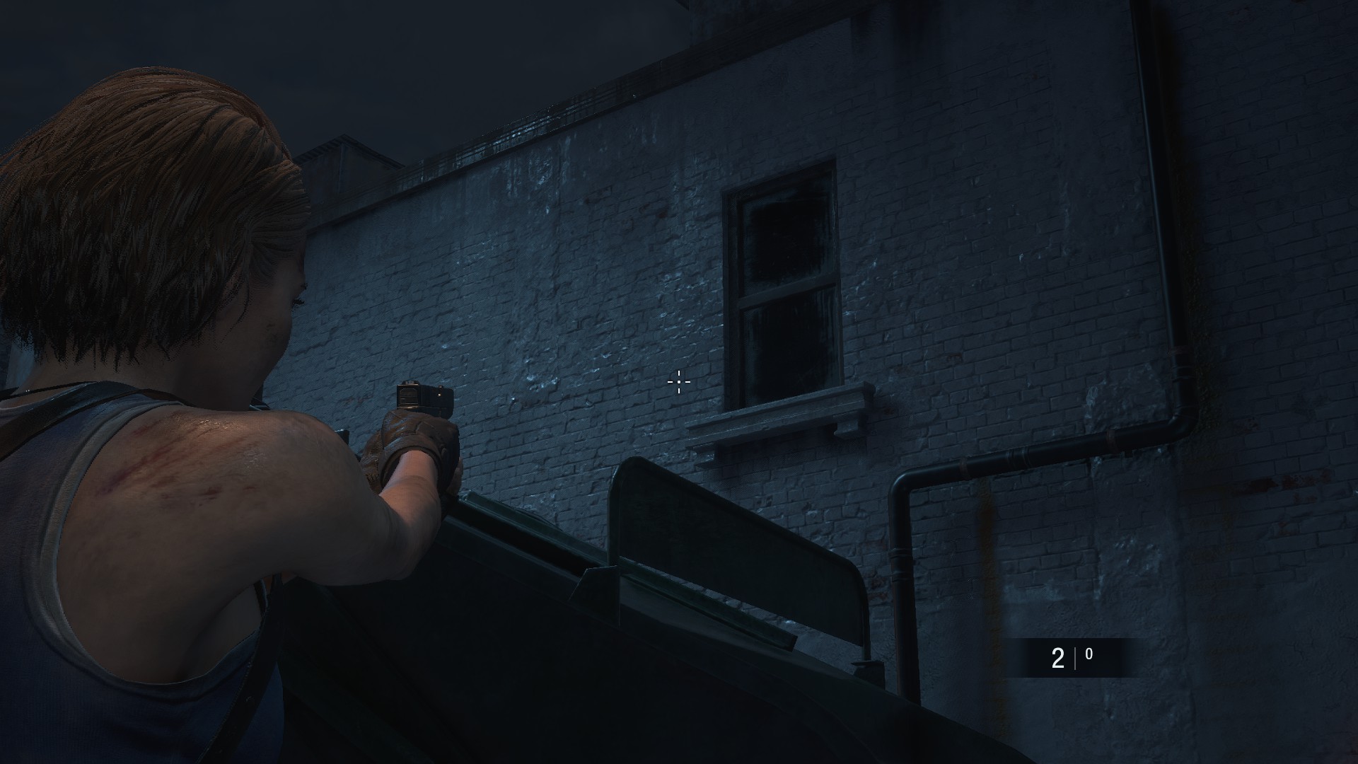
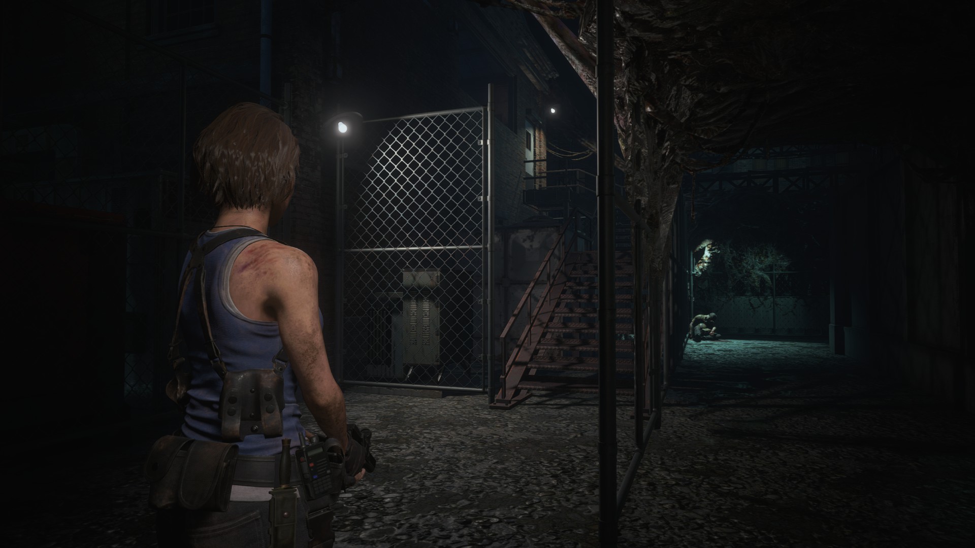
Cold spotlight outside of view, creates a very interesting contrast between the dark foreground and bright background. Because it’s out of view, it creates an interesting shadow, and the cold color implies caution. Makes it very tense to turn around this corner!
A subtle outside-of-view light whose sole purpose is to create the material definition seen here.
I love this example and it shows the mastery of the lighting team in the game. They placed a very dim and purplish “fake” frustum/spotlight here to create shadows and simulate atmospheric lighting. Without this light here, this corner would look extremely boring. The warm light on the right side also communicates to the player that it’s time to go right.
Another outside-of-view frustum/spotlight to create depth/shadows and the specular response necessary to sell the materials.
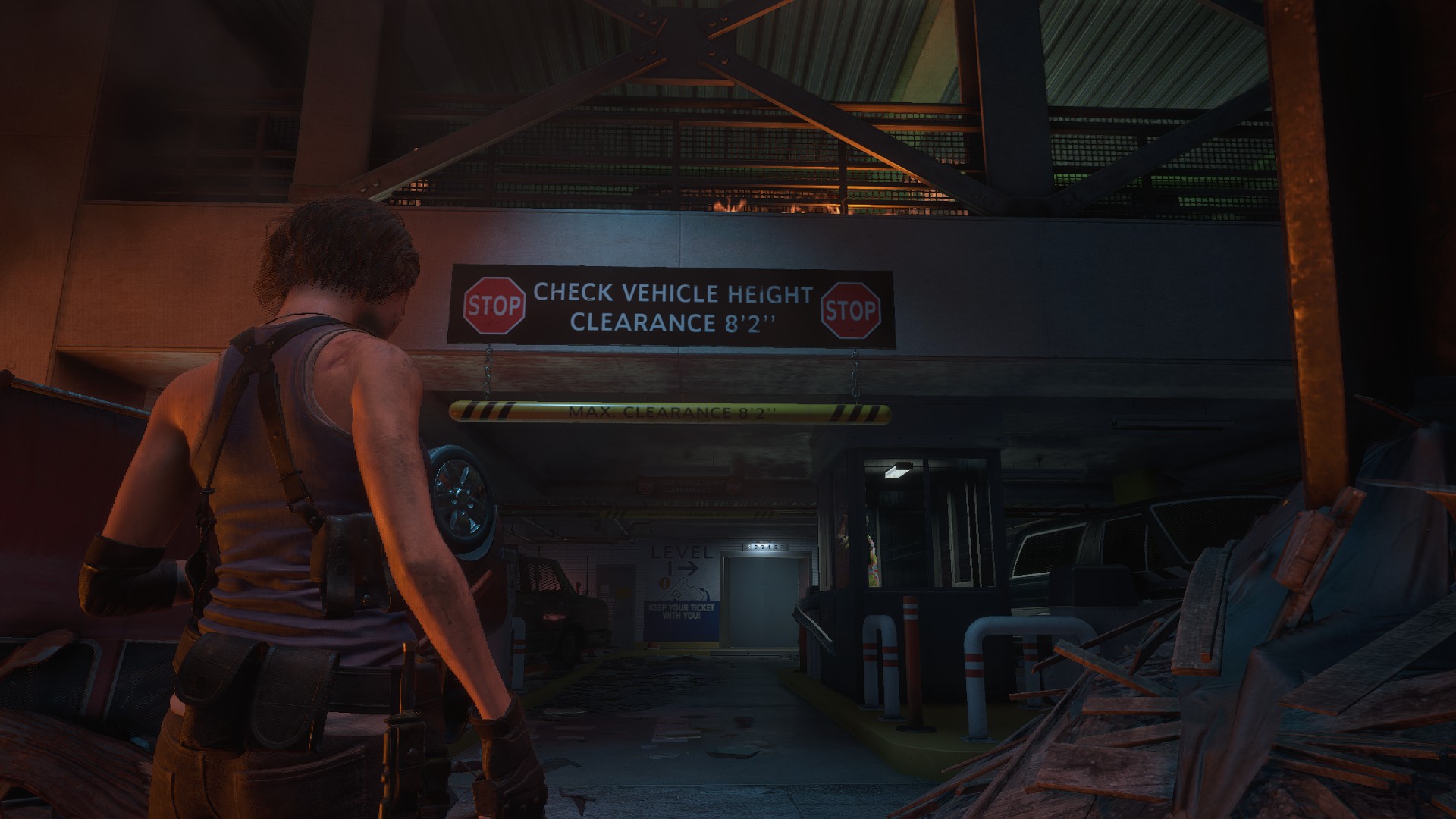
This view has two very visible light sources: The one in the guard booth and the one in the elevator. Because they are the only bright light sources around, they create a visual hierarchy. The player understands that he first needs to check the booth, and then go to the elevator in the back.
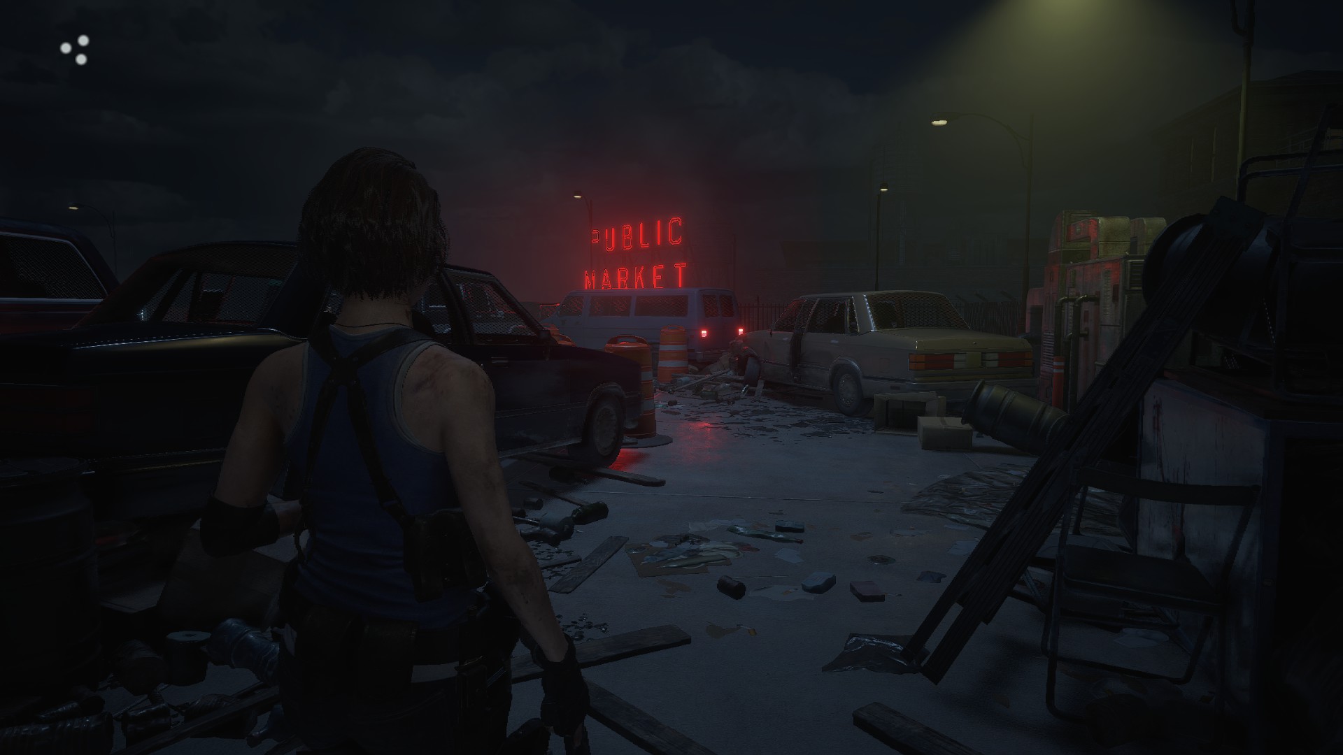
I love this example. The red light guides you towards the bend. Notice how all the other lights are kept very subtle so the red light really stands out. A common mistake here would be to fill this area with lights, as one would find in a real parking lot.
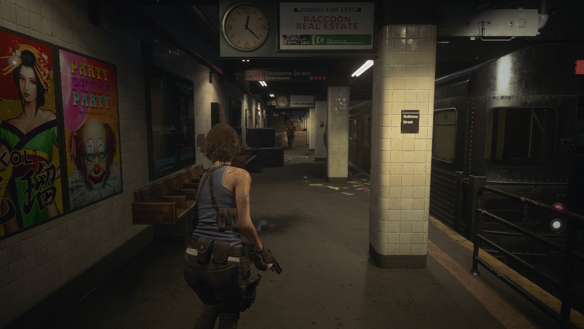
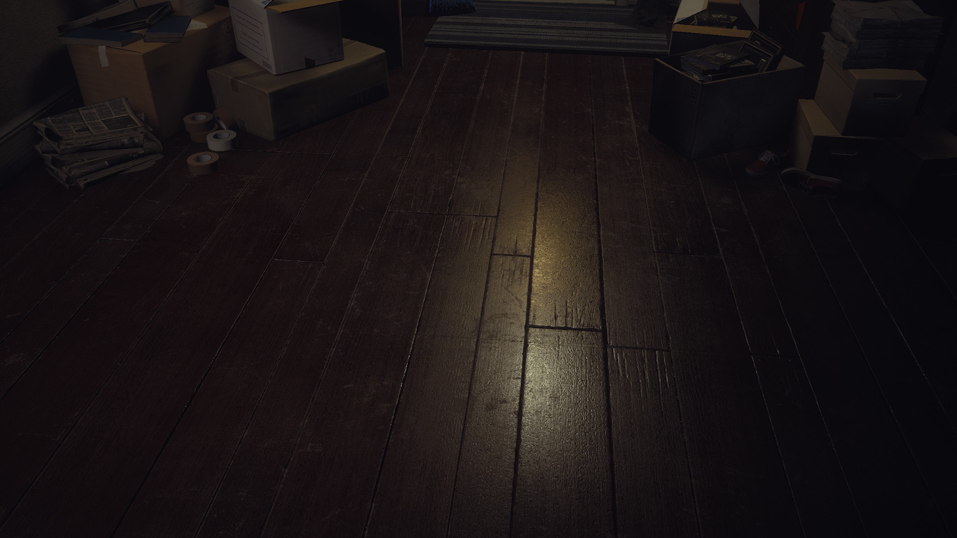
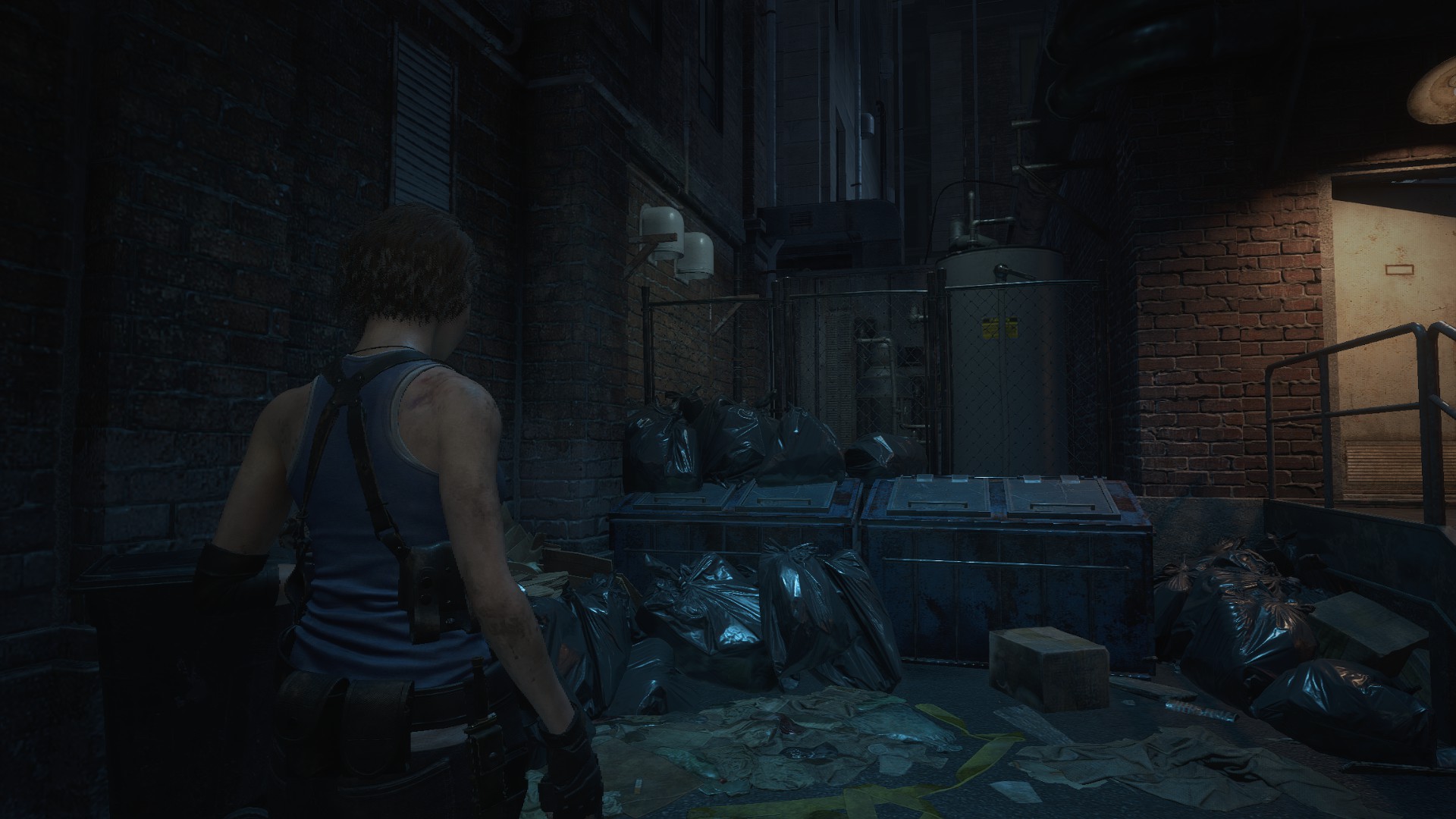
This is an interesting contrast to everything I’ve said so far. This area doesn’t have gameplay and is more of a resting place. The team just kept the lighting more “mundane” and even throughout the space. This reduces friction and makes you feel safer in this area.
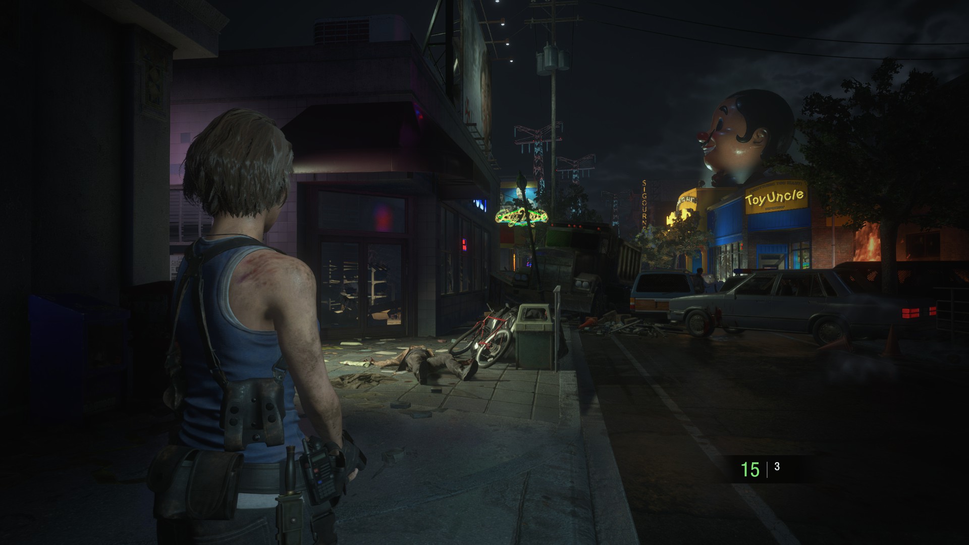
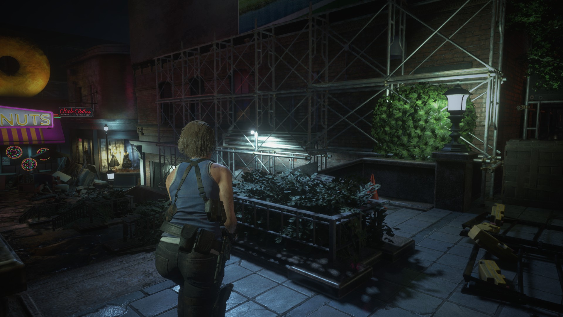
Another great scene. The player is supposed to go the toy store in the back (that stands out in terms of lighting and color), however since the way is blocked, the player is supposed to take the left, where a carefully placed spotlight creates converging lines that draw you there.
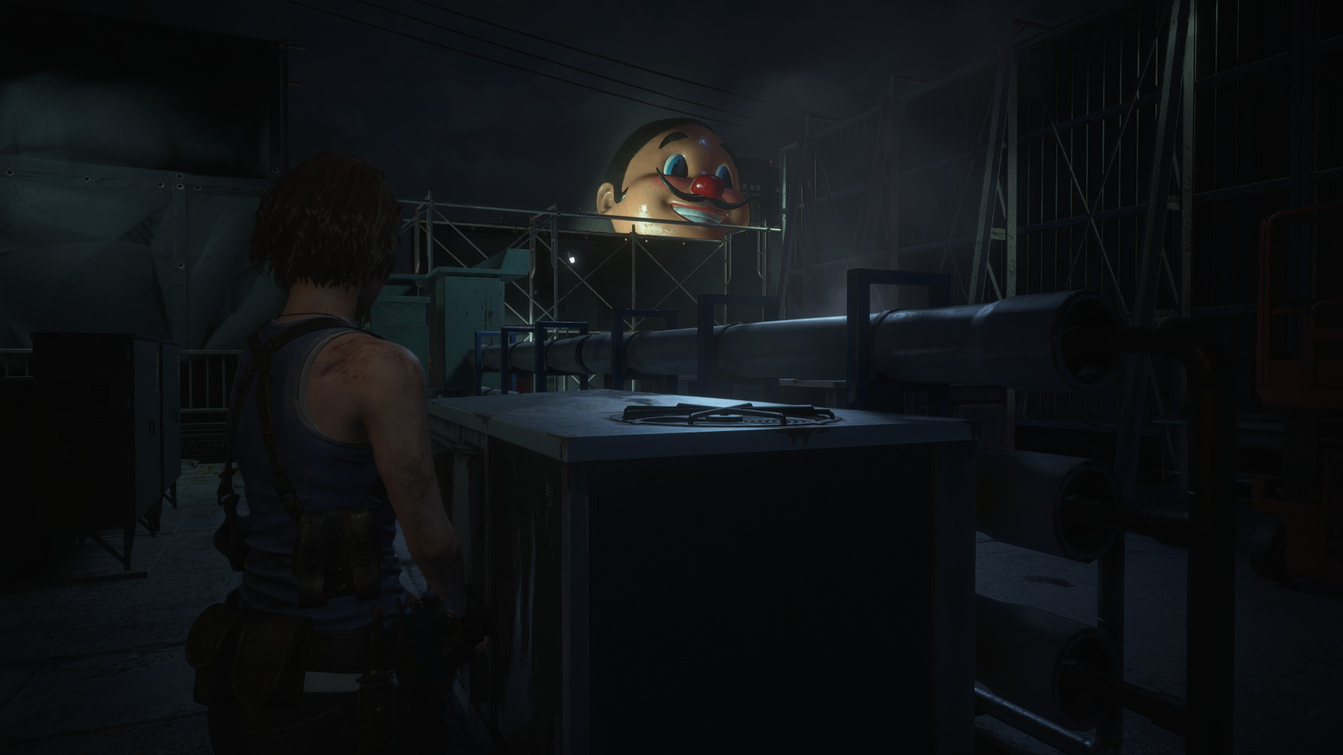
A common mistake that I’m guilty of committing before is to make emissive signs too bright, because “neon signs need a big bright bloom”. If you observe neon lights in real light, they are not so bright as games usually make them, and the bloom comes more from the contrast. In this example, the neon light is the only bright object in that area, which creates the bloom necessary to sell the idea. Since this is just set dressing and not a place the player needs to go, no big frustum/spotlight was placed. However, if the player was supposed to go here, one could easily place a big frustum light there.
Beautiful spotlight used for material definition and lighting this area. Without this spotlight here, the normal and roughness maps wouldn’t pop.
A “fake” frustum/spotlight was used here to create shadows, and light up the space subtly. The Bright emissive sources tell you where to go.
A “fake” frustum/spotlight was used here to enhance the edges and make this otherwise dark area read well.
This is a bit of a dark area. Notice how the only major light here is the yellowish spot light that delineates a “safe” area where you can run to. A big red light was used in the background to create shadows and contrast. Notice the visual hierarchy. The one that’s functional is much brighter than the one used just for readability.
A great example of highly functional lighting. The 3 light sources all have two purposes: creating shadows and guiding the player. No “fluff” lights were used in this area, except these highly functional ones. The team also used different colors of light to separate the areas and help with navigation. Subconsciously the player will remember that they came from the “white” lights area if they get lost and look around.
In Closing
There’s a lot more that I could say for the lighting in this game, but I will stop here.
Some takeaways:
- Be very careful with how you place your lights in the level. If they are not serving any specific purpose, maybe it’s better to tone it down or remove it.
- When lighting a game level, don’t try to light like a real place would be lit (usually the lighting in real places is very even and just used to illuminate areas). In games, it’s much more interesting to use lighting as a tool to create shadows, areas of contrast and interest, etc…
- Use lighting to enhance your materials. Nothing shows a roughness better than a good specular response. Experiment with this and see what works well!
- Avoid using overly bright emissives, unless you know exactly what you are doing.
- Study lighting in cinema for ideas on how to bring out shapes and tell a story.
If you enjoyed this content and would like to be notified when I publish new content, subscribe to my mailing list here.